
Tuesday, 17 May 2011
Some idea of feedback about scrolling bar
Some idea of feedback about scrolling bar came up yesterday.

Saturday, 14 May 2011


VGCFM website treatment mockup
I had been comparing about keeping missed data or deleting missed data.


Here are the criteria and evaluation about these two approaches:
2. Safety, Interface stability:
Evaluation: will take approach 2: delete the missed data. It will not sacrifice the usability to achieve creativity.


Here are the criteria and evaluation about these two approaches:
1. Creative:
Keep missed data: Create a new way to present data and read data. New design element such as data completeness bar has get involved.
Delete missed data:
People would not know the exist of missed data. The design would be a usual way to present data.
2. Safety, Interface stability:
Keep missed data:
Might take a bit risky.
Inevitably one would get a feeling that the information are not completed, unfinished, unreliable.
Delete missed data:
Works look finished, connected, logically, without questions.
Wednesday, 11 May 2011
Color contrast on website series3
Grid-base design
Have taken a bit more time to figure out what is grid-based design and had known a basic. For all I have researched, the screen resolution takes a important part to develop a grid. Usually we design a website for the 1024×768px resolution, then you will settle 960px (because it’s divisible by 3, 4, 5, 6, 8, 10, 12, 15, 16). Here is a good tutorial show a web layout with 960 Grid setting with 12 columns. Another article also talks about 960 Grid but I think he mixes the meaning of columns and guideline.
There is another “noun”: Baseline
How do you set a baseline grid? Why they set 24px? Should adjust fonts size with baseline matching?
Teehan+lax: “The traditional sizes to go with this baseline (9, 10, 11, 12, 14, 16, 18, 21, 24, 30, 48, 60, 72 points): these sizes prove to be extremely useful when combined with leading derived from 3.
Coming up with a grid for print requires multiple calculations based on page format, font choice, font size, leading, etc. Hopefully these calculations are not necessary for digital design, and web design in particular: on screen, the baseline grid is essentially determined by leading.”
Related reading:
http://www.tutorial9.net/tutorials/photoshop-tutorials/design-a-clean-web-layout-with-the-960-grid/
Tuesday, 10 May 2011
Color contrast on website series2
Color type choosing:
Some important theories:
RNIB:
“People with cognitive or sight problems may have difficulty reading and distinguishing text from a background colour. This is generally caused by poor choice of colour and contrast in the design of the page. Background images and patterns may also cause problems of legibility.
Creative use of colour and contrast can dramatically enhance the accessibility of a website. It can be as important for people with sight problems as it is to people who have dyslexia or whose first language is not the main language of the site.
Everyone benefits from text which is both easy on the eye and that is easy to follow. For example, people with dyslexia benefit from good contrast as this can help make the structure of words and sentences easier to understand.”
Attention:
“Colour blindness affects the way that certain colours differ from others. Red and green, for instance, can appear to be virtually the same to some users. Ensure that you choose colours that have a good differentiation for people with colour deficiency. You can find out more on the Vischeck website."
So there is no one “best” combination of text and background colours. Background does not have to be coloured, and texts do not have to be coloured. Pages should be designed flexible that could allow users to change the colour scheme.
I predict my work has not to be visual divided into the content areas but should good at using color contrasts.
Color choose for vision impaired principles:
1. Exaggerate lightness differences between foreground and background colors, and avoid using colors of similar lightness adjacent to one another, even if they differ in saturation or hue.
2. Choose dark colors with hues from the bottom half of this hue circle against light colors from the top half of the circle. Avoid contrasting light colors from the bottom half against dark colors from the top half. The orientation of this hue circle was chosen to illustrate this point.
3. Avoid contrasting hues from adjacent parts of the hue circle, especially if the colors do not contrast sharply in lightness.
Color theme choose:
Charity / school / college / education / student:
http://kuler.adobe.com/#themes/search?term=college no (the rate ones are belong to some other college)
http://kuler.adobe.com/#themes/search?term=student no (no rate ones)
http://kuler.adobe.com/#themes/search?term=charity no (too much colors that have to use as light color)
 |
| Education theme |
 |
| Charity theme |
Relative reading:
Monday, 9 May 2011
Compare RNIB and QAC: Analyze color use on RNIB


5 steps approach:
Describe:
- Use larger scale of color
- The choose of color are similar (a bit of difference)
- The order to arrange colors is different
- Different visual appeal result
Identify:
- How do you choose the color type based on the vision ability of vision impaired people?
- What the design style is suitable for those people?
- What is the relationship between text and color?
Interpret:
- Use color contrast to strongly divide different contents area to help the capability of reading.
Evaluate:
- The visual impaired are easier to read on the site
Reflect:
- Large background of color filling is definitely a good way to distinguish different type of information.
Sunday, 8 May 2011
Color contrast on website series1
Question:
How do you use color contrast on website to strength and exaggerate color effection? Presume it is for people with visual impairment.
Analyze:
Color contrast on web is no more than color text against uncolored background, uncolored text against color background and color against each other.
A good example uncolored text against color background which RNIB has done to show the large scale color background strength the contents discrimination.
I would like taking a try on color text against uncolored background to achieve the same effection,though QAC has done in a bad result :(
Brief: VGCFM website treatment
To use data and images from the Virtual Gallery of Contemporary Fine Metalwork DVD-ROM to create an interface and design suitable for a website version of the same. This should take into account the specific nature of the web, web page design and interactivity, in relation to this dataset and its presentation.
Challenge: some data of each image or the artist are missed. How do you present that data in order to minimize or hide the fact that the data is not 100% complete.
Challenge: some data of each image or the artist are missed. How do you present that data in order to minimize or hide the fact that the data is not 100% complete.
Monday, 2 May 2011
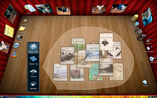
Reading on 3D desktop design
Principle used:
Feedback involves keeping users informed about what's happening by providing appropriate feedback & enabling communication with your app.
Two examples using in the work:
1. When a user clicks to the book, it shows visually that tell user the book has selected.
2. When a user clicks page by page on the right side, the book will response as thin to thick (left pages to right one)
To provide an understandable, familiar, and predictable environment. To give users a visual sense of stability, the interface defines many standard graphical elements.
Some examples using in the work:
menu bar, search box, book outlook
Use metaphors that represent concrete, familiar ideas, and make the metaphors obvious, so that users can apply a set of expectations to the computer environment.
Examples using in the work:
the book design, the way to note/tag
Criteria & Evaluation:


- Feedback & communication:
Feedback involves keeping users informed about what's happening by providing appropriate feedback & enabling communication with your app.
Two examples using in the work:
1. When a user clicks to the book, it shows visually that tell user the book has selected.
2. When a user clicks page by page on the right side, the book will response as thin to thick (left pages to right one)
- Perceived stability:
To provide an understandable, familiar, and predictable environment. To give users a visual sense of stability, the interface defines many standard graphical elements.
Some examples using in the work:
menu bar, search box, book outlook
- Metaphors:
Use metaphors that represent concrete, familiar ideas, and make the metaphors obvious, so that users can apply a set of expectations to the computer environment.
Examples using in the work:
the book design, the way to note/tag
Criteria & Evaluation:
- Suit for the 3D desktop environment
- Bring enjoyment
- Easy to use
- Clear / simple of all functions
- Visual appeal


Design a pop-up window
It's transparent. why?

The size?
The way of layout?

Principles:
- Make the pop-up window transparent so the visitor can still view the text on the page behind it.
- Text on the pop-up window should be readable and legible.
- Help the window stand out from the background, but different from formal access.
- Flexible size setting, but the window size is never more than 1460*740 px set to 1600*900 resolution.
- Layout: arrange text & graphic in logical order / where you place that element depends on it's relationship to the other pieces.
- Grid-based design
- Simplicity: only show the necessary information.
- Achieve the communication task: Quickly have a glance and get the mainly infos and decide if read or not.
- Text & background: achieve readability and legibility.
- Simplified: only show the useful infos
Book preview on 3D desktop
On 2D desktop, documents placed in the way that parallel with the desktop, while on 3D desktop they placed random and mostly will in a slanted status.
What would the slanted document display when click it to preview?

Principles:
- Put the user in control:
A user should not always feel in control, able to do what they want when they want. (the process of desktop status changed should not be noticed)
- Keep the user in informed
(A user would understand the change)

 |
| tech: keep the right way to the target document |
 |
| normal display |
 |
| on the basis of the way book's placement, the desktop would in a rotation status. |
Book manipulate on 3D desktop
As my earlier article BumpTop 3D desktop showed the video about BumpTop for Mac. It introduced some tech about desktop items manipulation.
I presumed if it goes to use in books, what the result will be.
Possibly they will be in this way:


Sunday, 1 May 2011
Design a search box for online book reading
According to my work, I need a search box that allow people search on both the book contents and the note they had made. It seems an advanced search box may be more suitable. That was my oringinal thought.
I changed my mind when I got the principle said “A search box should be simple”, which mean advanced search is advanced, and users gel confused tring to use it. It is more user-friendly to have no advanced search options displayed by default.
Therefore, how do you use the simple search box to tackle this issue. My way is make the title of the search box as clear as possible, just show what they can do, and leave others to the computer. Like type “Keywords and sentence” to get the book page or note where show the related words.
Take the principles to check the temporarily result:
•Name on submit button can be capital letter or search icon or an arrow.
"search" is better than "find", "go'.
•The optimal position for section titles is the upper-left area above the search box.
•Text displayed in the input field should easy to read.
•Input fied length should be appropriate.
•The search fit the website's overall design perfectly yet manage to stand out slightly when users need it.
•The submit button is a button, it should be designed like on, and look different than input field.
I changed my mind when I got the principle said “A search box should be simple”, which mean advanced search is advanced, and users gel confused tring to use it. It is more user-friendly to have no advanced search options displayed by default.
Therefore, how do you use the simple search box to tackle this issue. My way is make the title of the search box as clear as possible, just show what they can do, and leave others to the computer. Like type “Keywords and sentence” to get the book page or note where show the related words.
 |
| idea/sketch/analyze/develop |
 |
| principles check |
Take the principles to check the temporarily result:
•Name on submit button can be capital letter or search icon or an arrow.
"search" is better than "find", "go'.
•The optimal position for section titles is the upper-left area above the search box.
•Text displayed in the input field should easy to read.
•Input fied length should be appropriate.
•The search fit the website's overall design perfectly yet manage to stand out slightly when users need it.
•The submit button is a button, it should be designed like on, and look different than input field.
Who knows the size of preview window for mac?
It seems that the size of preview window are fixed, though the window for WORD documents look bigger. And they are always horizontal square boxes that seem to make a consistence with the screen appearance. Is there any principles to design the shape? What would happen if make a vertical window's shape?
How do you choose sharing buttons on web app design?
Are there as many sharing buttons as good on web app? How about design for a online book reading app. What matters on choosing sharing tools? My feeling is to know the function of sharing widgets and know the audience who might use those. Then determine some. What your opinion?
Join conversation in User Experience
Join conversation in User Experience
Thursday, 28 April 2011
Which book display version do you like more?
 |
| Option1 |
 |
| Option2 |
Criteria & Evaluation:
- Easy to distinguish (choose1)
- Identification (2>1, book cover is an icon as itself)
- Distinguish it from other document such as PDF, WORD. It is a specific app. (choose 1)
Wednesday, 27 April 2011
New media and technology brief
Will 3-dimensional desktop be a trend? BumpTop had brought lots fun for users though it is not available for the moment. Imaging what if the 3D desktop lead the trend again, what would it affect reading experience? Is it change the way we read on line? what need to be reconsidered? What could we do more when reading a book and what features would remain?
Sunday, 27 March 2011
BumpTop 3D desktop
BumpTop has been acquired by Google. It will no longer be available fore sale. It is still unknown what Google has planned for the software.
Thursday, 24 March 2011
I have to stop working to blame about this

I am doing some kind of work now, and seeing this web source Accept Jesus, Forever Forgiven from web page that suck. That shocked me, couldn't understand how does it challenge your tolerance.
An earlier discuss talk about Why Do Web Designers use Light Gray Type on a White Background? That problem might be hard for reading text by light the contrast of background and text. And it also cause the readability problem. For this dazzling, rich colorful, flashing background make your feeling like lightning a bomb, and want shut the window off as soon as possible. Have you ever noticed what the text on the website yet?
Wednesday, 23 March 2011
The highest color contrast = The most legible solution on screen?
As my earlier article said, black and white provide the highest contrast, and similar color paris such as white and yellow on black and blue background could produce the highest color contrast as well.
Is that mean it will determine the best choice for screen text reading?
Some public cases shows when a message or instruction involves a more complicated explanation, black and white provide the highest contrast this does not always provide the most legible solution. The book “about face” gives a obvious example to support this idea: British road signs using white (sans serif) lettering on a dark-green background; “hazard warning” signs where black letters are used on a yellow background.


Is it possible that the message or instruction on web involves a more complicated explanation?…
Therefore why do you believe it is safe to choose a black color type?
Thursday, 17 March 2011
Does x-height really matter when choosing fonts in using for readability and legibility?
If using a typeface with a low x-height at a large point size, wouldn't it has the same result as using a medium or large x-height smaller point size. So does it means x-height only useful when setting very small like 6 point size fonts?
more answer in StackExchange
more answer in StackExchange
Tuesday, 15 March 2011
Resolution setting to achieve readability series 1: Different media—fonts size on screen and print
How do you remove fonts size on print to screen to achieve readability?
Fonts size is different between screen and paper. Why?
How do you measure both sizes?
How do you exchange them?
What are the standard resolution/fonts size for them to achieve good readability?
The computer screen is not a piece of paper and is not read at the same distance or orientation as print on paper. We do not notice that fonts size is different setting on both of them because they all designed by people-oriented considering.
Font sizes in inches are fine on a piece of paper but meaningless on a PC screen where the size of anything is measured in pixels.
Inches on a piece of paper are physical inches which using point when output on print, and Inches on a screen are logical inches that the unit is pixels. See the explanation of logical inch.
A formula given by the emdpi.com make a connection of inches and pixels
font size in pixels = font size in inches × screen dpi
For example:

Screen dpi and image or scanner dpi are different concepts.
The common term of DPI is a fixed number for a given printer. It is a phisical characteristic of a printer, and also known as the maximum resolution that a printer is capable of. Low-end printers have lower DPI while high-end printers have higher DPI.
When printing it is important to make sure that the DPI is higher or equal to the PPI. If the DPI is lower than the PPI the printer will not be able to fully display the high resolution of the photo.
300 dpi is going to look fine, 600 dpi will look great, 1,200 dpi is excellent, and once you get above 1,200 dpi, it’s going to be nearly impossible to see any difference in whatever you’ve printed.
You might got question about “Is it same DPI requirement for both pics and text on print?” I don’t know, but from Scott Elli's answer it would be the same for text.
Screen dpi would be more sense if we called “screen ppi”( pixels per inch). It has one purpose, and one purpose only, and that is to transform screen inches into screen pixels. It has nothing to do with physical inch measurements or screen images. The dots in screen dots per inch are pixels, but the inches are logical inches and not physical inches. see here
There is some relationship between Text Size and Screen Resolution. A survey of Browser Text Size settings from clickdensity shows:
1. The vast majority of visitors (99.7%) use default (Medium) text size settings.
2. Approximately twice as many visitors (0.2%) increase their text size than decrease their text size (0.1%).
3. Users with very low (640 x 480) or very high (larger than 1600 x 1200) screen resolutions are at least twice as likely to change their text size settings (compared to users with resolutions from 800 x 600 to 1280 x 1024).
Monday, 14 March 2011
How would you choose colour if you want to produce the most readable text?
Colours can contrast in hue, value and saturation. Hue and saturation are not important for legibility, but value does. Black and white create the highest contrast possible. That’s because white has a 100% brightness value, whereas black has a brightness value of 0%. It is common to use a combination of them to avoid a dull page.
Reason:
Text readability depends on the ease of distinguishing letter and word shapes which in turn depends on the discrimination of fine detail. High achromatic contrast maximizes this aspect of perception. Since the chromatic system has 1/5 the spatial resolution of the achromatic system, color cannot produce fine detail.
Contrast of value:
Common example:
Black text on white paper/white text on black paper.
Color of print and background:
1. Black print on white background is more legible than white print on blackground, due to the smaller number of fixation pauses. Three fourths of readers prefer black type on a white background.
2. The legibility of black print on tinted paper varies, according to the reflectance of the tinted paper. If the reflectance is over 70%, there is no notceable loss in legibility for type over 10 points in size.
3. The great the brightness contrast between print and background, the higher the legibility.
4. Dark ink on a light shade of colour ink or coloured paper results in the most legible combinitions of colored ink on a colored background.
Contrast of value and hue combination:
The further way on the colour wheel of two colors are, the higher hue contrast.
The larger differences in lightness of two colors are, the higher value contrast.
Example:
A bright warm color and a dark cold color. (cold colours appear to be more distant, while warm colour appear to be closer)
Such as: bright red for text and dark blue for background
Contrast of value and saturation combination:
The further distance of two colours in saturation, the higher saturation contrast.
And The larger differences in lightness of two colors are, the higher value contrast.
Example:
A interesting effect of saturation contrast is that a setting of colour with different saturations set against a grey background.
Such as:
Rich red for text on light grey background.
Colour contrast does not achieve legibility:
Contrast only hue or saturation
Examples:
red-blue, green-yellow, green-white, green-gray ("button gray", the Windows standard gray) etc. (high hue contrast, they have small value contrast)
Summarize:
The best combinations have the two brightest colors, white and yellow, contrasted with the two darkest colors, black and blue: black-white, blue-white, blue-yellow, and black-yellow. Red has a dark intermediate brightness and works reasonably well against all backgrounds but blue.
Thursday, 10 March 2011
Why not use san-serif fonts on print design?
It's better to use san-serif than serif fonts on web, as their simpler letter form remain readable at low resolution. serif fonts need more pixels to display their extra details. I was wondering why I seldom see any san-serif fonts for body text on print design?
Join the conversation. go.
Join the conversation. go.
Wednesday, 23 February 2011

Tuesday, 22 February 2011
William Gibson – poor structure, poor typogaphy

Click to the website
As Tom Jeatt said:
"the text doesn’t scale, and with images/style off it’s completely unusable.
There is no contrast between the text and the background and there is also a confusing mix of uppercase and lowercase letters. The only actual text looks as if it’s been autogenerated to link to Twitter.
The structure of the website I would categorise as absent. There are no clear areas of content, no obvious navigation and the site title appears halfway down the page."
Add some more:
Button feedback--confusing
layout that suck
what's the use for repeating words on the background
what's the theme of the website
color various
Type should not be run across photographs or illustrations. This can limit the contrast and confuse the eye.
Saturday, 19 February 2011
Definition for legibility & readability
Legibility:
Legibility refers to the recognizability of individual glyphs (the individual markings that signify the semantic character(s)).
a measure of how easy it is to distinguish one letter from another in a given typeface.
“Legibility” is based on the ease with which one letter can be told from the other.
Get a reader’s attention and interest
Legibility is mostly a function of typeface design. It’s a measure of how easy it is to recognize one letter or word from another and how easy blocks of text are to read.
Legibility is a function of typeface design. It’s an informal measure of how easy it is to distinguish one letter from another in a particular typeface.
Legibility is primarily the concern of the typeface designer, to ensure that each individual character or glyph is unambiguous and distinguishable from all other characters in the font. Legibility is also in part the concern of the typographer to select a typeface with appropriate clarity of design for the intended use at the intended size. An example of a well-known design, Brush Script, contains a number of illegible letters since many of the characters can be easily misread especially if seen out of textual context.
A range of factors influence a glyph’s legibility:
stroke, width, angle (of the stroke), style (e.g. roman, full-capitals), slant (of the whole style), color (actual color and typographic color, i.e. contrast), background color, and more.
How legible a typeface is designed to be depends on its purpose.
Type size, Type weight, Type style/posture, Line length, Letterspacing, Wordspacing, Linespacing, Justified vs flush left/right, Lowercase/all caps/small caps, Contrast between type and background, Serif vs sans-serif
Readability:
Readability refers to the recognizability of whole words, sentences, paragraphs, tables, or whatever the text en masse constitutes.
Readability – how easy words, phrases, and blocks of text can be read. Readability describes how a typeface is used on the page.
“Readability” is the ease with which the eye can absorb the message and move along the line.
Be easy to read
Readability is a function of how typefaces are used. It’s about how inviting your type is to read and about getting the viewer to want to read it.
Readability applies to the overall reading experience. It’s macro-typography and it’s about making type aesthetically pleasing in order to make it more inviting to read.
Readability, on the other hand, is dependent upon how the typeface is used. Readability is about typography. It is a gauge of how easily words, phrases and blocks of copy can be read.
Readability is primarily the concern of the typographer or information designer. It is the intended result of the complete process of presentation of textual material in order to communicate meaning as unambiguously as possible. A reader should be assisted in navigating around the information with ease, by optimal inter-letter, inter-word and particularly inter-line spacing, coupled with appropriate line length and position on the page, careful editorial “chunking” and choice of the text architecture of titles, folios, and reference links.
A range of macro factors affect readability:
the measure (line length), the leading (line height or spacing), justification or alignment, the style of the typeface, the kerning and tracking, the size of the type, and more.
The reader shouldn’t even notice the type.
Type size, Type weight, Type style/posture, Line length, Letterspacing, Wordspacing, Linespacing, Justified vs flush left/right, Lowercase/all caps/small caps, Contrast between type and background, Serif vs sans-serif
Other opinions for legibility and readability:
Legibility applies to parts of the text like letters and words and paragraphs. It’s micro-typography. It’s about type’s ability to be easily read, particularly under normal reading conditions.
Readability is most often and more properly used to describe the ease with which written language is read and understood—it concerns the difficulty of the language itself, not its appearance. Factors that affect readability include sentence and word length, and the frequency of uncommon words.
In contrast, legibility describes how easily or comforably a typeset text can be read. It is not connected with contentor language, but rather with the size and appearance of the printed or displayed text.
Readability in English has different meanings. One relates to the ease of reading and understanding a text. Another meaning relates to the ease of visually recognizing letters, numbers, or other symbols on a page, sign, or electronic device. In English, this second meaning is generally referred to as legibility to which another article is dedicated. There is a third meaning related to the sufficiency of embedded documentation in computer-program code, described in the section below, "Readability in computer programming."
Legibility: A Trait, Not Always a Goal
First, not all typefaces are–or should be–created with legibility as a primary design function. Many faces are drawn for the purpose of creating a typographic statement, or for providing a particular spirit or feeling to graphic communication. Some typefaces are just designed to stand out from the crowd. To the degree that a typeface has personality, spirit, or distinction, however, it almost always suffers proportionally on the legibility scale.
Readability is a measure of the comprehensibility or understandability of written text. There are many methods and formulas for determining readability and the related reading age.
Other unknown factors(don’t know which do them belong to?):
sentence and word length, and the frequency of uncommon words.
the size and appearance of the printed or displayed text.
Language
Wednesday, 16 February 2011
Why does google now have such a terrible interface for pictures
Google now has such a terrible interface for pictures

Friday, 11 February 2011
Bad example of User Interface / Navigation

In the last 15 years, I've seen plenty of examples of stupid navigation. This may be the worst.
All are mess!!
No button exist O.o
Text clickable, some are not O.o
Using folder metaphor O.o
Layout O.o
Apply the legibility principles to screen reading
Questing for "Apply the legibility principles to screen reading"
Here is Berin Loritsch’s answer from the dictionary definitions.
Legibility - Also called visibility. Typography. the quality of type that affects the perceptibility of a word, line, or paragraph of printed matter.
Readability - Typography . the property of type that affects the ease with which printed matter can be read for a sustained period.
See more his words, practically speaking……
Snlchina gave a more clearly definition about these two words.
Readability is most often and more properly used to describe the ease with which written language is read and understood—it concerns the difficulty of the language itself, not its appearance. Factors that affect readability include sentence and word length, and the frequency of uncommon words.
In contrast, legibility describes how easily or comforably a typeset text can be read. It is not connected with contentor language, but rather with the size and appearance of the printed or displayed text.
Wikipedia gives “Readability” a widely definition.
Readability in English has different meanings. One relates to the ease of reading and understanding a text. Another meaning relates to the ease of visually recognizing letters, numbers, or other symbols on a page, sign, or electronic device. In English, this second meaning is generally referred to as legibility to which another article is dedicated. There is a third meaning related to the sufficiency of embedded documentation in computer-program code, described in the section below, "Readability in computer programming."
Now Im thinking about what do these contribute to my lecture topic? O.o
Saturday, 5 February 2011
HUI design principle-metaphors
Criteria for good examples:
Use metaphors involving concrete, familiar ideas and make the metaphors plain.
Let people can connect the idea from something familiar with the app.
The use doesn’t have to limit the implementation of the metaphor.
Should be spread widely throughout the interface, rather than used once at a specific point. Even better would be to use the same metaphor spread over several apps.
An application cannot incorporate several different metaphors, as long as they don’t clash.
What about the cultural boundaries? (U.S. mailbox with a rounded top, a flat bottom, and a little red flag on the side, but there are no mailboxes of this style in Europe.)
Good examples:
File folder
Desktop
Trash can
Menus
itunes playlists
iphoto albums
Dashboard
Tape transport controls
Music sequencers ( incorporate both “tape transport” and “sheet music” metaphors)
Source comes from:
Apple computer, Inc. (1993) Macintosh Human Interface Guidelines. Mariani Avenue Cupertino: Addison-Wesley Professional. ISBN: 0201622165
Subscribe to:
Posts (Atom)