
Tuesday, 17 May 2011
Some idea of feedback about scrolling bar
Some idea of feedback about scrolling bar came up yesterday.

Saturday, 14 May 2011


VGCFM website treatment mockup
I had been comparing about keeping missed data or deleting missed data.


Here are the criteria and evaluation about these two approaches:
2. Safety, Interface stability:
Evaluation: will take approach 2: delete the missed data. It will not sacrifice the usability to achieve creativity.


Here are the criteria and evaluation about these two approaches:
1. Creative:
Keep missed data: Create a new way to present data and read data. New design element such as data completeness bar has get involved.
Delete missed data:
People would not know the exist of missed data. The design would be a usual way to present data.
2. Safety, Interface stability:
Keep missed data:
Might take a bit risky.
Inevitably one would get a feeling that the information are not completed, unfinished, unreliable.
Delete missed data:
Works look finished, connected, logically, without questions.
Wednesday, 11 May 2011
Color contrast on website series3
Grid-base design
Have taken a bit more time to figure out what is grid-based design and had known a basic. For all I have researched, the screen resolution takes a important part to develop a grid. Usually we design a website for the 1024×768px resolution, then you will settle 960px (because it’s divisible by 3, 4, 5, 6, 8, 10, 12, 15, 16). Here is a good tutorial show a web layout with 960 Grid setting with 12 columns. Another article also talks about 960 Grid but I think he mixes the meaning of columns and guideline.
There is another “noun”: Baseline
How do you set a baseline grid? Why they set 24px? Should adjust fonts size with baseline matching?
Teehan+lax: “The traditional sizes to go with this baseline (9, 10, 11, 12, 14, 16, 18, 21, 24, 30, 48, 60, 72 points): these sizes prove to be extremely useful when combined with leading derived from 3.
Coming up with a grid for print requires multiple calculations based on page format, font choice, font size, leading, etc. Hopefully these calculations are not necessary for digital design, and web design in particular: on screen, the baseline grid is essentially determined by leading.”
Related reading:
http://www.tutorial9.net/tutorials/photoshop-tutorials/design-a-clean-web-layout-with-the-960-grid/
Tuesday, 10 May 2011
Color contrast on website series2
Color type choosing:
Some important theories:
RNIB:
“People with cognitive or sight problems may have difficulty reading and distinguishing text from a background colour. This is generally caused by poor choice of colour and contrast in the design of the page. Background images and patterns may also cause problems of legibility.
Creative use of colour and contrast can dramatically enhance the accessibility of a website. It can be as important for people with sight problems as it is to people who have dyslexia or whose first language is not the main language of the site.
Everyone benefits from text which is both easy on the eye and that is easy to follow. For example, people with dyslexia benefit from good contrast as this can help make the structure of words and sentences easier to understand.”
Attention:
“Colour blindness affects the way that certain colours differ from others. Red and green, for instance, can appear to be virtually the same to some users. Ensure that you choose colours that have a good differentiation for people with colour deficiency. You can find out more on the Vischeck website."
So there is no one “best” combination of text and background colours. Background does not have to be coloured, and texts do not have to be coloured. Pages should be designed flexible that could allow users to change the colour scheme.
I predict my work has not to be visual divided into the content areas but should good at using color contrasts.
Color choose for vision impaired principles:
1. Exaggerate lightness differences between foreground and background colors, and avoid using colors of similar lightness adjacent to one another, even if they differ in saturation or hue.
2. Choose dark colors with hues from the bottom half of this hue circle against light colors from the top half of the circle. Avoid contrasting light colors from the bottom half against dark colors from the top half. The orientation of this hue circle was chosen to illustrate this point.
3. Avoid contrasting hues from adjacent parts of the hue circle, especially if the colors do not contrast sharply in lightness.
Color theme choose:
Charity / school / college / education / student:
http://kuler.adobe.com/#themes/search?term=college no (the rate ones are belong to some other college)
http://kuler.adobe.com/#themes/search?term=student no (no rate ones)
http://kuler.adobe.com/#themes/search?term=charity no (too much colors that have to use as light color)
 |
| Education theme |
 |
| Charity theme |
Relative reading:
Monday, 9 May 2011
Compare RNIB and QAC: Analyze color use on RNIB


5 steps approach:
Describe:
- Use larger scale of color
- The choose of color are similar (a bit of difference)
- The order to arrange colors is different
- Different visual appeal result
Identify:
- How do you choose the color type based on the vision ability of vision impaired people?
- What the design style is suitable for those people?
- What is the relationship between text and color?
Interpret:
- Use color contrast to strongly divide different contents area to help the capability of reading.
Evaluate:
- The visual impaired are easier to read on the site
Reflect:
- Large background of color filling is definitely a good way to distinguish different type of information.
Sunday, 8 May 2011
Color contrast on website series1
Question:
How do you use color contrast on website to strength and exaggerate color effection? Presume it is for people with visual impairment.
Analyze:
Color contrast on web is no more than color text against uncolored background, uncolored text against color background and color against each other.
A good example uncolored text against color background which RNIB has done to show the large scale color background strength the contents discrimination.
I would like taking a try on color text against uncolored background to achieve the same effection,though QAC has done in a bad result :(
Brief: VGCFM website treatment
To use data and images from the Virtual Gallery of Contemporary Fine Metalwork DVD-ROM to create an interface and design suitable for a website version of the same. This should take into account the specific nature of the web, web page design and interactivity, in relation to this dataset and its presentation.
Challenge: some data of each image or the artist are missed. How do you present that data in order to minimize or hide the fact that the data is not 100% complete.
Challenge: some data of each image or the artist are missed. How do you present that data in order to minimize or hide the fact that the data is not 100% complete.
Monday, 2 May 2011
Reading on 3D desktop design
Principle used:
Feedback involves keeping users informed about what's happening by providing appropriate feedback & enabling communication with your app.
Two examples using in the work:
1. When a user clicks to the book, it shows visually that tell user the book has selected.
2. When a user clicks page by page on the right side, the book will response as thin to thick (left pages to right one)
To provide an understandable, familiar, and predictable environment. To give users a visual sense of stability, the interface defines many standard graphical elements.
Some examples using in the work:
menu bar, search box, book outlook
Use metaphors that represent concrete, familiar ideas, and make the metaphors obvious, so that users can apply a set of expectations to the computer environment.
Examples using in the work:
the book design, the way to note/tag
Criteria & Evaluation:


- Feedback & communication:
Feedback involves keeping users informed about what's happening by providing appropriate feedback & enabling communication with your app.
Two examples using in the work:
1. When a user clicks to the book, it shows visually that tell user the book has selected.
2. When a user clicks page by page on the right side, the book will response as thin to thick (left pages to right one)
- Perceived stability:
To provide an understandable, familiar, and predictable environment. To give users a visual sense of stability, the interface defines many standard graphical elements.
Some examples using in the work:
menu bar, search box, book outlook
- Metaphors:
Use metaphors that represent concrete, familiar ideas, and make the metaphors obvious, so that users can apply a set of expectations to the computer environment.
Examples using in the work:
the book design, the way to note/tag
Criteria & Evaluation:
- Suit for the 3D desktop environment
- Bring enjoyment
- Easy to use
- Clear / simple of all functions
- Visual appeal


Design a pop-up window
It's transparent. why?

The size?
The way of layout?

Principles:
- Make the pop-up window transparent so the visitor can still view the text on the page behind it.
- Text on the pop-up window should be readable and legible.
- Help the window stand out from the background, but different from formal access.
- Flexible size setting, but the window size is never more than 1460*740 px set to 1600*900 resolution.
- Layout: arrange text & graphic in logical order / where you place that element depends on it's relationship to the other pieces.
- Grid-based design
- Simplicity: only show the necessary information.
- Achieve the communication task: Quickly have a glance and get the mainly infos and decide if read or not.
- Text & background: achieve readability and legibility.
- Simplified: only show the useful infos
Book preview on 3D desktop
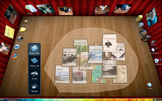
On 2D desktop, documents placed in the way that parallel with the desktop, while on 3D desktop they placed random and mostly will in a slanted status.
What would the slanted document display when click it to preview?

Principles:
- Put the user in control:
A user should not always feel in control, able to do what they want when they want. (the process of desktop status changed should not be noticed)
- Keep the user in informed
(A user would understand the change)

 |
| tech: keep the right way to the target document |
 |
| normal display |
 |
| on the basis of the way book's placement, the desktop would in a rotation status. |
Book manipulate on 3D desktop
As my earlier article BumpTop 3D desktop showed the video about BumpTop for Mac. It introduced some tech about desktop items manipulation.
I presumed if it goes to use in books, what the result will be.
Possibly they will be in this way:


Subscribe to:
Posts (Atom)